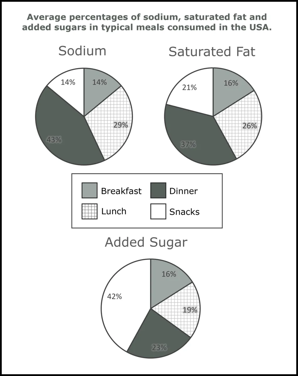
"The charts below show the average percentages in typical meals of three types of nutrients, all of which may be unhealthy if eaten too much.
Summarize the information by selecting and reporting the main features, and make comparisons where relevant."
Write at least 150 words.
Structure:
Before you begin make sure you know the right structure for writing Task 1. The structure you should use for a graphic is as shown on the picture to the right.
Introduction. Here you just paraphrase (say with different words) the task prompt.
Overview. Here you summarize the key trends of the graphic. It could be the highest or the lowest points on the picture.
Key Trend 1. Pick your first clear trend, change, similarity or difference between the data and report that.
Key Trend 2. Pick your second clear trend, change, similarity or difference between the data and report that.
Length: No more than 170 words and no less than 150.
The Data:
The easiest way to select data points on a pie is to look for the largest and the smallest category, or two that are close to or the same.
This method does not work in every single graphic, but it is a good general rule to know.
In these pie charts we can select:
Key Trend 1 - Sodium and Saturated fats are consumed the highest at night (dinner). This can be your overview.
Key Trend 2 - The most added sugar comes from snacking.
*You may think that this is way too simple, however often times this is the whole point of the exercise. They don't want you to dig deep into the graph in search of the most creative thing you can notice. Actually, they want you to report the MOST obvious thing.
Example Answer:
Introduction:
There are three pie charts that presentthe amount of sodium, saturated fat, and added sugar eaten in four different meals in the USA.
Structure:
There are _______ pie charts that present the amount of ________.
Charts => pie charts
show => present
nutrients => sodium, saturated fat, added sugar
Overview:
Looking at the big picture, the highest amounts of sodium (43%) and fatty foods (37%) were consumed at dinner time, while the top percentage for sugary foods (42%) was eaten in form of snacks.
Structure:
Looking at the big picture _______, while _______.
Added sugar => sugary foods
Saturated fat => fatty foods
Key Trend 1:
An interesting data point about all three sodium, saturated fats, and sugar is that all pie charts have a common similarity, with a relatively small percentage intake in the morning. Breakfast accounted forthe lowest consumption, with 14% and 16% and 16% respectively.
Structure:
An interesting data point about both _______ and _______.
_______ accounted for _________ and _________ respectively.
Focus on the lowest but similar points of the graphic.
Key Trend 2:
Another key feature of the graphics is the added sugar pie chart, where the picture was somewhat different from the rest, with relative similarity in the intake during the three main courses with 16%, 19%, and 23% from morning to evening. Numbers were more varied for salty and fatty foods.
Word Count: 151
Structure:
Another key feature of the graphics is the ________, where the picture was somewhat ________, with ________.
Numbers were more varied for ________.
Focus on the similar intakes in the last pie - sugar.